Branding
Cargar
Rebranded Cargar as a distinct EV charging system. Complete with a scalable visual identity system for multiple sibling products under one brand.
Year :
2022-24
Industry :
EV Charging
Client :
Cargar
Project Duration :
~2 years

Problem :
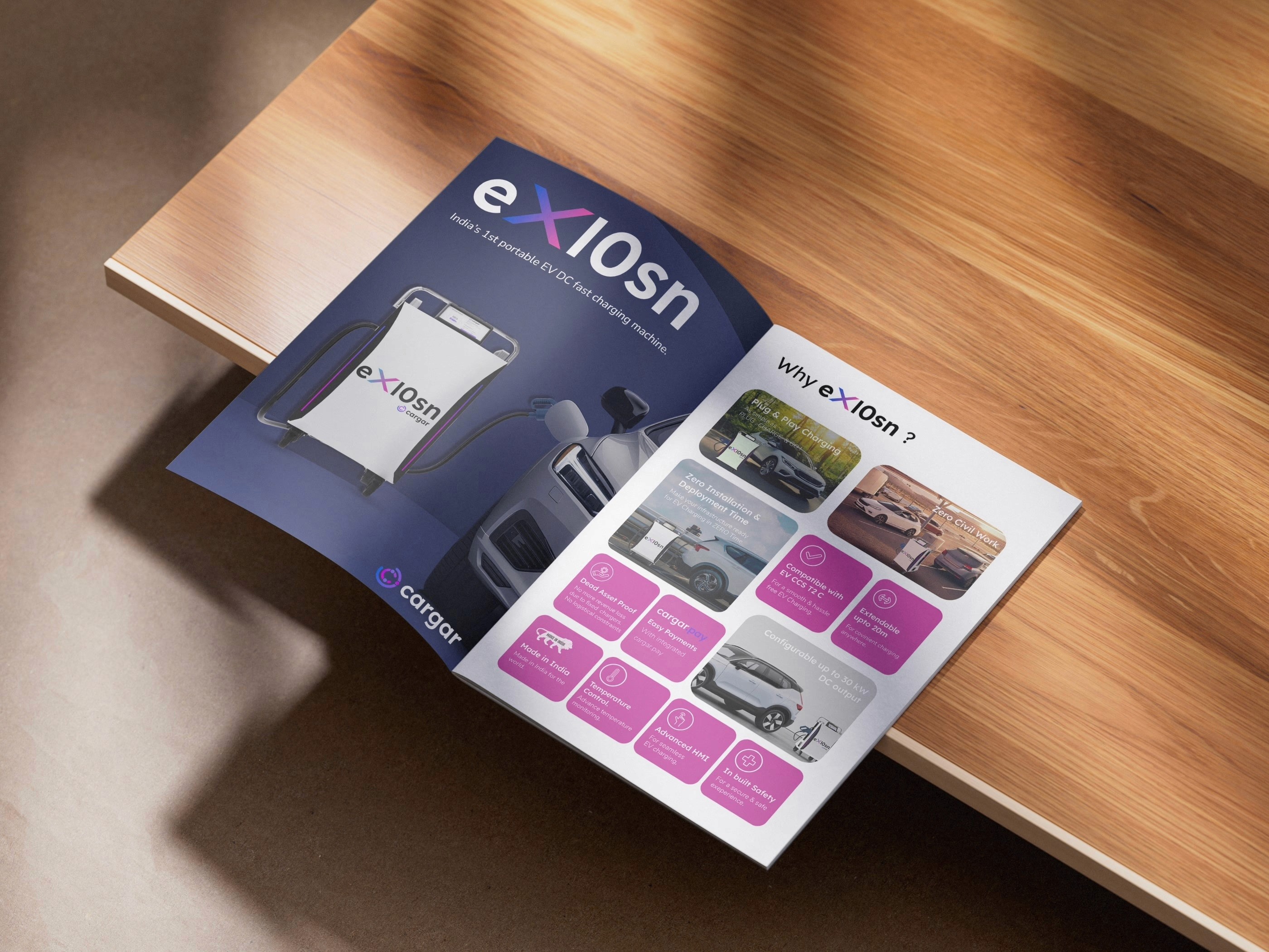
As an emerging startup in India’s competitive EV and renewable energy sector, Cargar lacked a cohesive visual identity to match its innovative "Energy as a Service" platform. While they had an existing logo, it failed to represent their premium positioning or provide a unified framework for their growing portfolio of flagship chargers, such as the EX10SN and Sole Charge.

Solution :
I executed a comprehensive brand rehaul centered on a bold, high-tech palette of deep purples, vibrant pinks, and electric violets (#7F3AED, #DA00FF) to instantly set Cargar apart.
The Logo: I redesigned the emblem by merging the letter 'C' with a lithium atomic model featuring three electrons, symbolizing the core of battery technology.
Visual System: To ensure consistency across diverse hardware, I developed a modular identity system. This allowed for unique product-level branding for their chargers and solar solutions while utilizing shared geometric patterns and the Lexend and Nunito Sans typography suites.
Implementation: I extended this new identity across all touchpoints, including stationery, technical brochures, exhibition standees, and custom map illustrations for their service platform.

Challenge :
The primary challenge was to achieve market differentiation in a landscape "flooded" with green, yellow, and blue branding. The founders established a strict non-negotiable: the new identity had to avoid these overused industry colors entirely. Furthermore, the brand system needed to be flexible enough to give individual products their own identity while maintaining a clear, "family" connection to the parent company.
Summary :
By breaking traditional industry color conventions, I delivered a "future-proof" brand identity that communicates excellence and reliability. The result is an energetic and customer-focused visual language that empowers Cargar to scale its flagship products under one unified, professional umbrella.


More Projects


Branding
Cargar
Rebranded Cargar as a distinct EV charging system. Complete with a scalable visual identity system for multiple sibling products under one brand.
Year :
2022-24
Industry :
EV Charging
Client :
Cargar
Project Duration :
~2 years
Problem :
As an emerging startup in India’s competitive EV and renewable energy sector, Cargar lacked a cohesive visual identity to match its innovative "Energy as a Service" platform. While they had an existing logo, it failed to represent their premium positioning or provide a unified framework for their growing portfolio of flagship chargers, such as the EX10SN and Sole Charge.
Solution :
I executed a comprehensive brand rehaul centered on a bold, high-tech palette of deep purples, vibrant pinks, and electric violets (#7F3AED, #DA00FF) to instantly set Cargar apart.
The Logo: I redesigned the emblem by merging the letter 'C' with a lithium atomic model featuring three electrons, symbolizing the core of battery technology.
Visual System: To ensure consistency across diverse hardware, I developed a modular identity system. This allowed for unique product-level branding for their chargers and solar solutions while utilizing shared geometric patterns and the Lexend and Nunito Sans typography suites.
Implementation: I extended this new identity across all touchpoints, including stationery, technical brochures, exhibition standees, and custom map illustrations for their service platform.
Challenge :
The primary challenge was to achieve market differentiation in a landscape "flooded" with green, yellow, and blue branding. The founders established a strict non-negotiable: the new identity had to avoid these overused industry colors entirely. Furthermore, the brand system needed to be flexible enough to give individual products their own identity while maintaining a clear, "family" connection to the parent company.
Summary :
By breaking traditional industry color conventions, I delivered a "future-proof" brand identity that communicates excellence and reliability. The result is an energetic and customer-focused visual language that empowers Cargar to scale its flagship products under one unified, professional umbrella.
More Projects
Branding
Cargar
Rebranded Cargar as a distinct EV charging system. Complete with a scalable visual identity system for multiple sibling products under one brand.
Year :
2022-24
Industry :
EV Charging
Client :
Cargar
Project Duration :
~2 years
Problem :
As an emerging startup in India’s competitive EV and renewable energy sector, Cargar lacked a cohesive visual identity to match its innovative "Energy as a Service" platform. While they had an existing logo, it failed to represent their premium positioning or provide a unified framework for their growing portfolio of flagship chargers, such as the EX10SN and Sole Charge.
Solution :
I executed a comprehensive brand rehaul centered on a bold, high-tech palette of deep purples, vibrant pinks, and electric violets (#7F3AED, #DA00FF) to instantly set Cargar apart.
The Logo: I redesigned the emblem by merging the letter 'C' with a lithium atomic model featuring three electrons, symbolizing the core of battery technology.
Visual System: To ensure consistency across diverse hardware, I developed a modular identity system. This allowed for unique product-level branding for their chargers and solar solutions while utilizing shared geometric patterns and the Lexend and Nunito Sans typography suites.
Implementation: I extended this new identity across all touchpoints, including stationery, technical brochures, exhibition standees, and custom map illustrations for their service platform.
Challenge :
The primary challenge was to achieve market differentiation in a landscape "flooded" with green, yellow, and blue branding. The founders established a strict non-negotiable: the new identity had to avoid these overused industry colors entirely. Furthermore, the brand system needed to be flexible enough to give individual products their own identity while maintaining a clear, "family" connection to the parent company.
Summary :
By breaking traditional industry color conventions, I delivered a "future-proof" brand identity that communicates excellence and reliability. The result is an energetic and customer-focused visual language that empowers Cargar to scale its flagship products under one unified, professional umbrella.